GTK 3.0 / Gnome 3.0 annoyance
It’s quite incredible that Gnome 3.0 was almost an identical mess as KDE 4.0 had been a year or two earlier. Both are much better now, more stable, but both also still have their issues, and don’t feel like a real improvement over Gnome 2.0 or KDE 3.5.
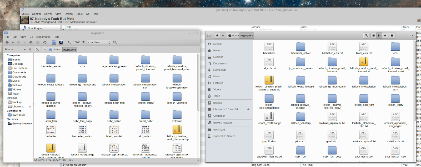
Now the main file manager for Gnome 3.0, Nautilus has buttons with nearly identical icons that mean vastly different things, one is a menu, the other is a list view. Also it does not integrate with other desktops well from a look and feel perpective, here is a screenshot under XFCE (KDE would not look better).The push for window buttons inside the toolbar makes for a funny looking window. In Gnome Shell, it’s not much better, plus there are some windows with a dark theme and some with a standard theme all mixed together.
On the left is Caja: an updated GTK 2.0 version of Nautilus. I find it more functional, I don’t really understand the push to remove most options from the screen in Gnome 3.0. The only positive thing I can see on for the new Nautilus, is the grey color for the left side, which looks more readable and polished.
Interestingly, Nautilus within Ubuntu Unity feels better, it has a real menu and standard looking window. I suppose they customized it quite a bit.
When it comes to HiDPI support, Gnome shell is often touted has having one of the best. Well maybe for laptop screens, but certainly not for larger screens, where it just double everything and everything just looks too big. XFCE is actually decent on HiDPI screens.